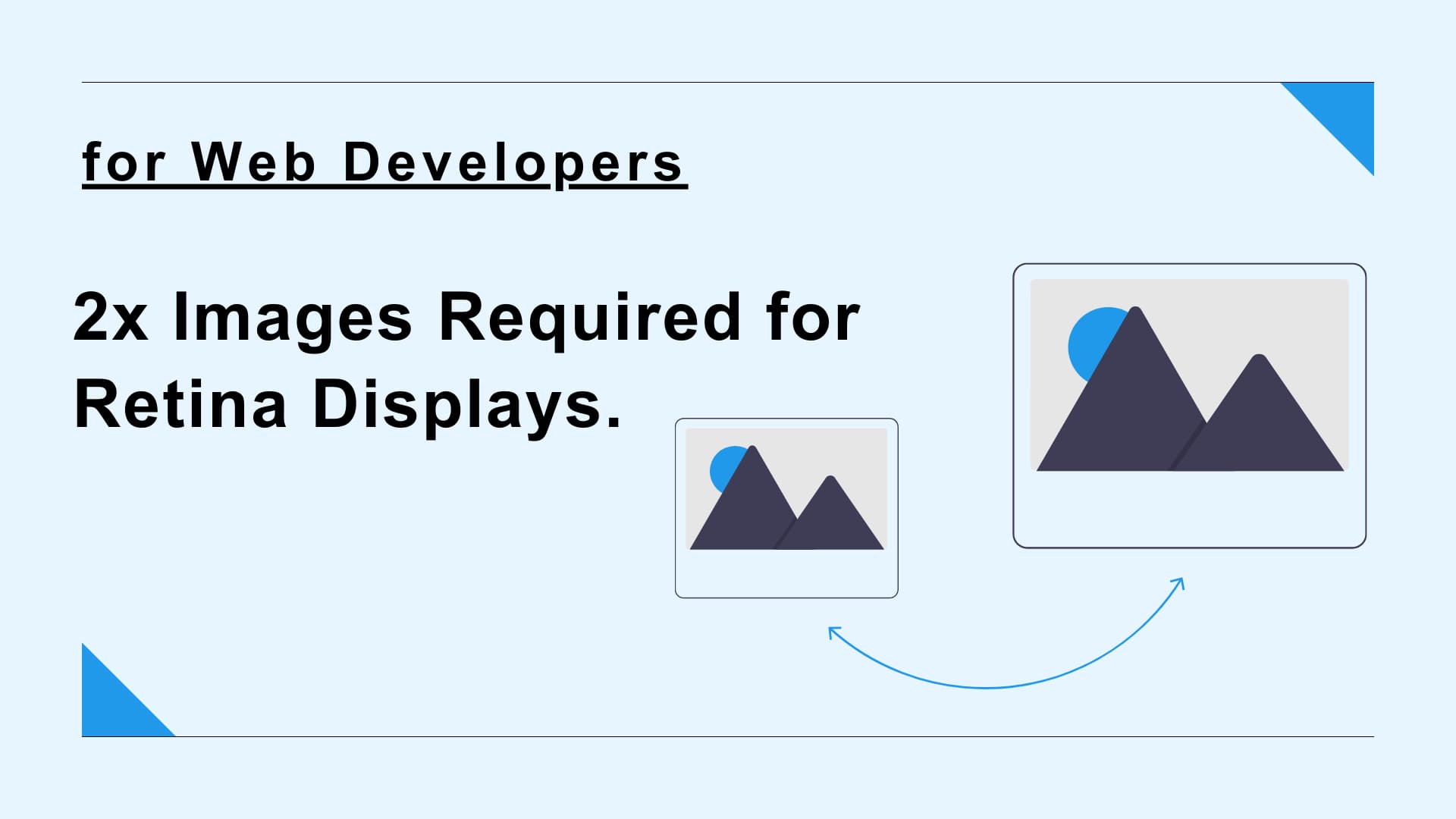
When displaying images on a website, web developers need to consider how the images will look on high-resolution displays such as Retina displays.
In principle, the images as asset should be prepared at twice the size of the actual display area. For example, suppose there is a 640 x 360px image area on a design comp. In this case, a 1280 x 720px image should be used as asset to display in the 640 x 360px display area.
This article explains mechanism of Retina displays, why double-sized images are needed for high-resolution displays, and how to switch images to be displayed according to viewer’s display resolution.
What is Retina display?
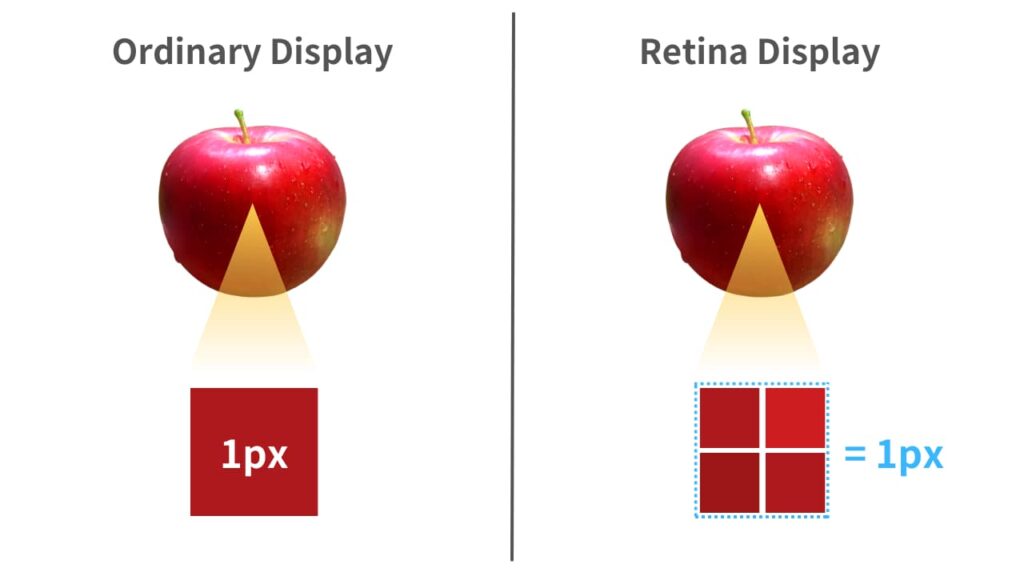
The Retina display is a high-resolution display developed by Apple that has a higher pixel density than ordinary displays. The pixel density of a Retina display is beyond the limits of what the human eye can distinguish. Therefore, when viewed at the proper distance, individual pixels cannot be distinguished and the image appears more natural and clear.
While ordinary displays have one color information per pixel, Retina displays consist of 2 x 2 cells (or more) per pixel, each of which contains color information. Because it has more color information than ordinary displays, it can display more detailed and clear images. The measure of how many cells are contained per pixel width is called Device Pixel Ratio (DPR). If 1px consists of 2 x 2 cells, the Device Pixel Ratio is 2.
Retina displays are used in many of Apple’s products, including the iPhone, iPad, and MacBooks. Retina display is a trademark of Apple, but is sometimes used as a term to describe high-resolution displays, regardless of whether it is an Apple product or not.
1x images are blurred on high-resolution displays
As mentioned above, Retina displays use 2 x 2 (or more) cells to represent one pixel of a ordinary display. If you export an image with the same size as the display area and display it on a Retina display as is, there is not enough color information in each of the 2 x 2 cells that make up a single pixel on a Retina display, resulting in blurring and poor quality.
By shrinking the size of an image exported at twice the size to half size and displaying it, the pixel density is made pseudo-dense and can be displayed beautifully on a high-resolution display.
Take a look at the following examples. If you are viewing this page on a device with a high-resolution display, you should be able to see the difference between the two images below.
Pattern A
Pattern B

Both images are displayed at 300 x 300px area, but there is a difference in the original image size. Pattern A uses an image of 600 x 600px, that is twice the size of the display area. On the other hand, Pattern B uses an image of 300 x 300px, that is the same size as the display area.
If you are using a high-resolution display, the image in Pattern B will appear slightly blurred with poor quality compared to Pattern A. The above example may seem like small differences, but as these cases accumulate, they can significantly change the overall impression of a website. Therefore, to make your website look beautiful on any device, web developer should export or prepare 2x Images.
Some high-resolution displays have even higher Device Pixel Ratio of 3 or more. However, there is almost no need to export an image at three times the size or more. Since it is difficult to distinguish the difference between 2x and 3x images with the naked eye, exporting 3x images will often be a futile effort that only increases file size and slows page display speed.
Switch images depending to DPR by srcset attribute
Some developers will want devices with DPR of 1 to display 1x images and devices with DPR of 2 to display 2x images. By using the srcset attribute of the <img> tag as shown below, the browser will automatically determine which image to load and display according to the Device Pixel Ratio of the viewing user’s device.
<img
  srcset="image.jpg 1x, image@2x.jpg 2x"
  src="image@2x.jpg"
/>
The srcset attribute can specify multiple comma-separated combinations of image url and display conditions. In the above example, the 1x and 2x in the srcset attribute represent the Device Pixel Ratio, respectively. In this case, image.jpg would be loaded on displays with DPR of 1, and image@2x.jpg would be loaded on high-resolution displays with a DPR of 2 or more.
The src attribute describes the image to be loaded when the browser does not support the srcset attribute.
The src attribute does not compensate for the failure to load the image defined in the srcset attribute. In other words, if the file path written in the srcset attribute is incorrect, the image defined in the src attribute will not be displayed, and the image itself will not be displayed on the page. Therefore, be careful to ensure that the file path is correct.
This method requires more man-hours than usual because it requires two types of images, 1x and 2x. Whether to use this method or to prepare only 2x images and display 2x images on all devices will depend on development requirements and developer preference. Both methods have their advantages and disadvantages.